Streamlining game-day sign-up for a college-sports membership
The product pivoted from a charity round-up app into a membership engine for college sports — and sign-ups moved to live, game-day activation stands. The old flow took about six minutes, which is a lifetime when there's a line behind you. This is how we made it fast enough for the context.
Company: Ascend Fundraising Solutions · Role: Product Designer · Focus: Onboarding and activation · Tools: Figma, Amplitude
Context
The product began with a round-up model: link a credit card, and every purchase rounds up to the nearest dollar for charity. It's a familiar concept, but relying on retail partnerships made it slow to scale. So we moved the rounding to the card level instead of the store level, removing the need for retail partnerships entirely.
We built this model and tested it with some charities. However, while defining which market to focus on, we spotted a bigger opportunity in college sports and student athletes in the US. So we pivoted, turning the round-up mechanic into the funding engine for a membership program supporting college athletic programs.
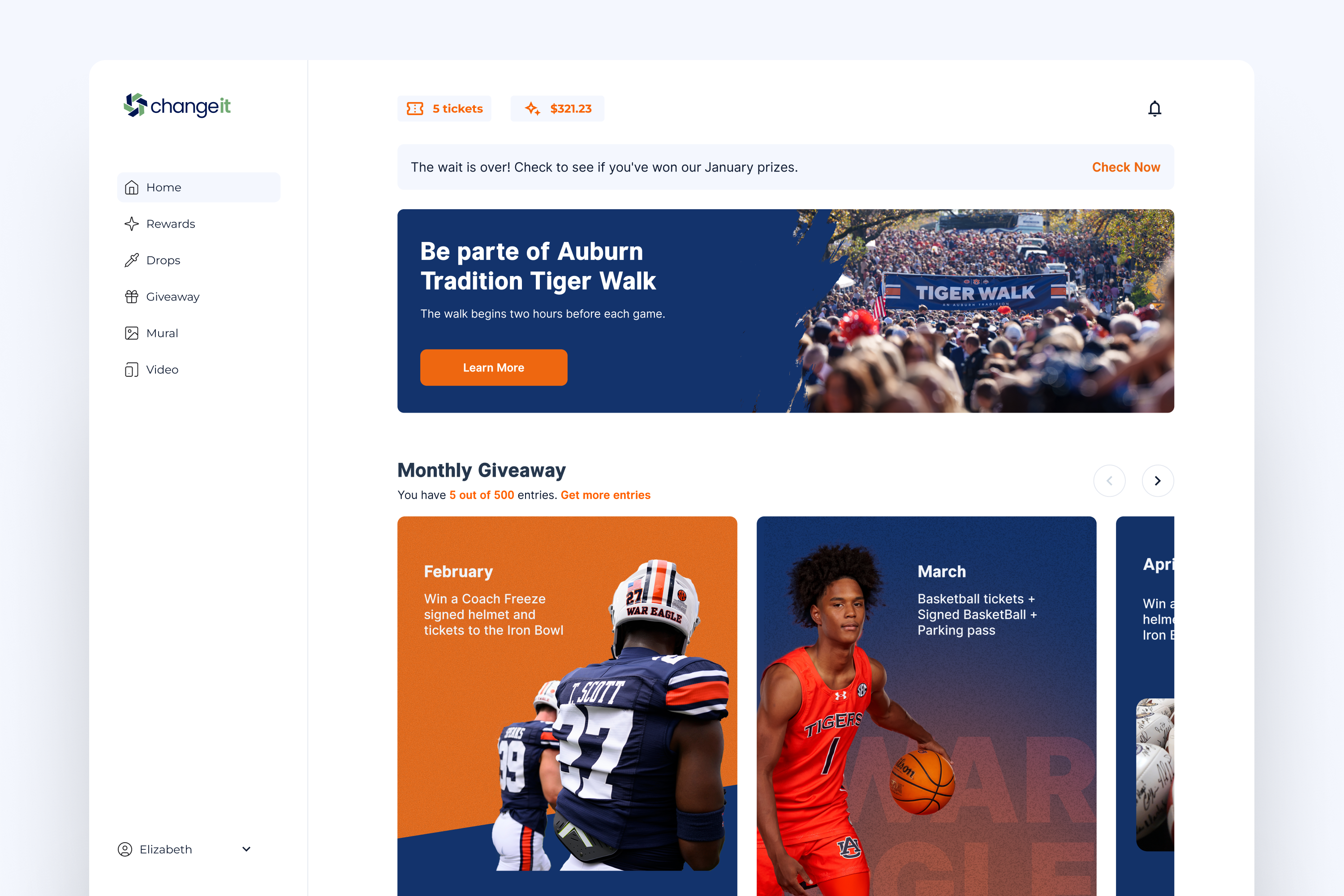
That shift asked for changes. Now we're signing up members in a very different setting: live game-day events, where people join on their phones at activation stands. In that environment, every extra step matters. A long line, a slow screen, or another pop-up is enough for someone to walk away.
At an on-site activation, we watched people try to sign up. The flow was not broken, but it was too slow for the context. It took about six minutes, and users had to move through several steps, wait for screens to load, and deal with pop-ups before they could finish.
The product had changed, the context had changed, but the sign-up flow had not caught up.
What we learned
People were trying to sign up in a real environment: on their phones, with limited time, distractions, and people waiting behind them. The on-site observation showed us how the experience felt. Then I used Amplitude to understand where the friction was happening in the funnel.
Account creation
Most people chose email sign-up, which went against the original design direction. The first version gave more priority to social login, but users were choosing email instead.
What we changed: We made email and password visible on the first screen, treated email as the main sign-up path, and removed the extra step.
Tier selection
The tiers page had the biggest drop-off.
What we changed: We moved tier selection before sign-up, made the tier cards easier to scan, removed the inner scroll, and added a clear select button. This sounds like a standard decision, but it came with a technical challenge: we did not always control every customer landing page, so the flow still needed a fallback when a tier could not be passed into sign-up.
Billing
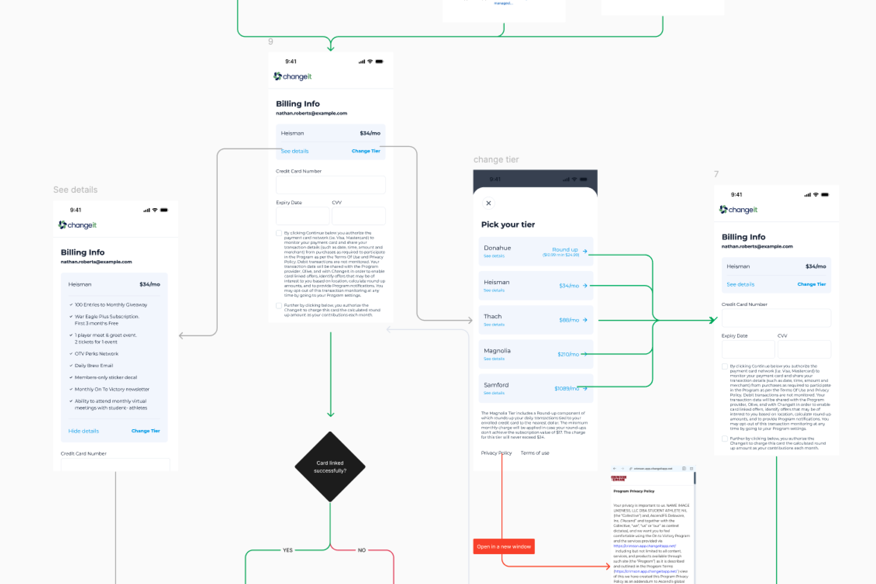
Billing was the last step before activation, but it had a third-party payment iframe that could load as a blank space.
What we changed: Added a loading state, kept tier details inside billing, and made it possible to change tiers without losing progress.
Conclusion
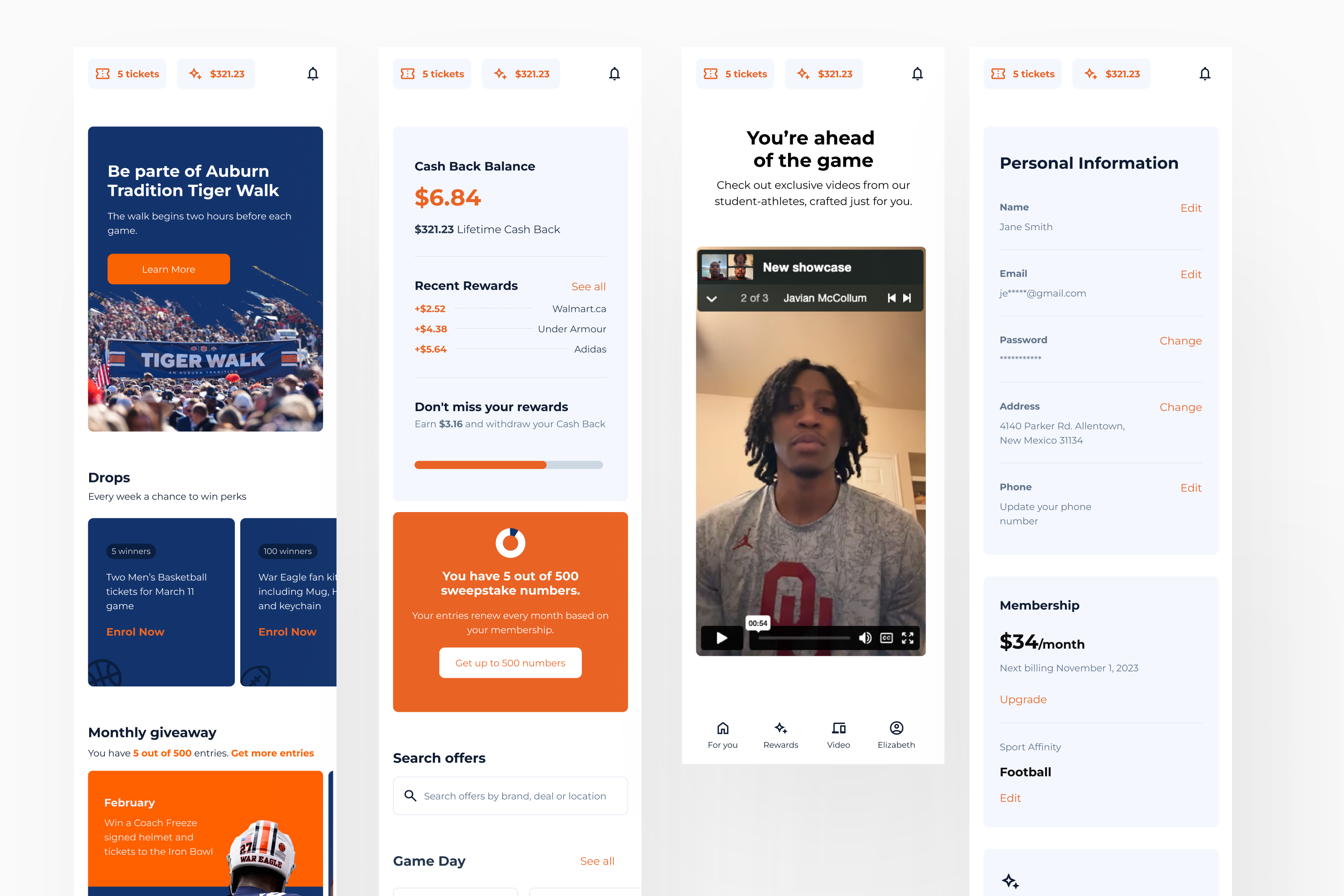
We got a significant improvement in the onboarding and activation process, with higher conversion numbers and reduced time to completion. This was one of many experiments we ran for this new product. We were validating a new model in a new market, and that required a fast and lean team to achieve what we did.